Monday, March 16, 2015

Photomontage

Research:

Photographer - Patrick Desmet
The theme of the artwork is the balance in nature. The newspaper that the man is reading shows the same image as the background, which could mean that there is no bad news, only good ones and how the environment is clean, not only in the newspaper but also in real life (the background). Patrick Desmet used line, shape, colour, texture, value, and space. He uses the different elements of art to balance out his composition. The usage of contrasting elements(of art) also help balance out the composition, the line, shape, and space created by Desmet shows that not only can nature work together to be harmonious, but also the elements of art can work together to create a beautiful piece of art. 
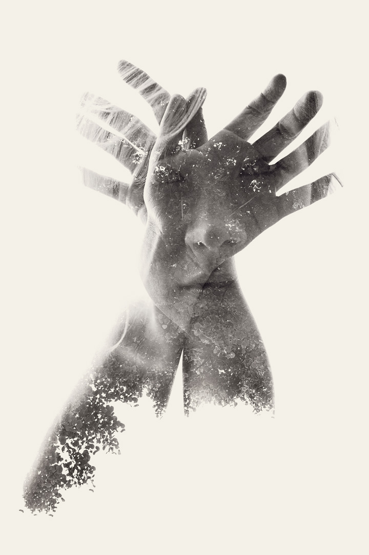
Photographer - David Hockney
The theme of the artwork is the telephone pole. David Hockney illustrates the theme through shaping the image into a shape. Hockney uses line, shape, colour, texture, and value. He uses the different elements of art to balance his composition; he balances it by forming his work from light to dark, the colour of the objects in each rectangular spaces that Hockney uses to make an image out of his piece and balancing out the contrasting values and textures in it.
________________________________________________________________________________
Theme: Reflections and outcomes.
There is going to be a girl on a bridge and looking down in the water where she sees what she wants to accomplish in the future. The water reflections will have a tile style theme to it.

Theme: Expectation vs. Reality of our world
There is going to a nice cabin like house with a beautiful background. On the side there will be a somewhat large painting of the opposite of the background, pollution and deforestation, on the top of the painting will say, reality.

^^^
My choice
Theme: Destruction in our world
There will be a skeleton wearing a gas mask standing near things that have been destructed, above the skeleton will be a grey coloured gas.

________________________________________________________________________________

Process:
I started with a dark background and a misty-like texture in the bottom.

Then I got half of a skeleton and made it wear a gas mask. I also made it look as if it is hanging from the top with a chain.

I started to place letters and words on the right side. 

Mid-Project Critique:


I changed the last words to "future." I also made the top of the background to greyish misty texture.
Then I started to add some things that caused destruction to our world

With the eraser tool, I changed the opacity to blend the things together with the background.
Final:
Our Future
Finally, I made the tree larger so it can help emphasis the destruction our world could have.
***
I used the different shades of grey to help balance the background. I choose light colours for the letters so that it would contrast to the background and pop out. I want the viewers to know the dangers that could happen in our world. I also chose to have a light-ish colour for the skeleton because it shows that our future world could be harmful.


________________________________________________________________________________
Images Borrowed:


Tuesday, January 13, 2015

Hands Project


There is going to be a dark background, in the middle of the canvas, there will be the earth and through the middle shooting from the sides will be hands, and on each side of the hands that are coming out, there will be hands coming from the side grabbing the hands coming out from the earth. I will use hands for the representation of the elements and warp them to make the hands look like the material of the elements.
________________________________________________________________________________
Process:

I started with placing the earth in the black background.

I placed the hands in the middle connected with each other.

Then I used the clone stamp tool to copy the texture of the different elements and stamping them on the different hands.

After I finished cloning and stamping the elements on the hands, I put the lightning in the middle which represents the energy coming out from the elements being pulled away from each other.

Final:
Title: Element Balance
This is the final piece. I added more lightning and moved the hands apart and smudged the hands near the earth.
 I used line, colour, shape, texture and value to express the balance of the earth, fire, water, air elements. My original statement was to have hands pulling each other (hands representing the elements of earth (fire, water, air, earth). My final piece influences the viewer because it illustrates that all the earth elements need each other for balance on our planet. When pulled away from the earth, it causes the hands to be tense which caused the electric (lightning) current that is coming our and around the hands and world. I used the pictures from my research to help me make my piece stronger. I used the first photo (the hands with the girl in them) to help me make the hands different textures from the elements. I used the second photo (the hand on fire) to help me have different values of the textures. I used the third photo (the guy holding the moon) to help me balance the photograph and to create value and contrast in my piece.


Ingredients:
- Fire, water, air texture
- Lightning
- The earth

________________________________________________________________________________

<


________________________________________________________________________________
Research:

Photographer - Christoffer Relander
The artist is emphasising the girl which are shown in the hands and the contrast of colours between the background and the hands. The artist uses lines, shapes, textures, value, colour, space to depict the girl hiding in the shadows of her hands. I can use this to make a sort of story/background about the hands.


Photographer - Philip Holm
This artist is emphasising the element of fire and using the texture of fire to show the burning of the hand. The artist uses line, shapes, colour, value, texture, space and form to illustrate the burning of the hand and or humanity. This photo inspired me to get the idea of using all the four elements (water, earth, fire, air), and by using this, I can create a series of hand elements for my design.


Photographer - Juanfer Penagos
This artist is emphasising the full moon with contrast with the black (paint) hands holding the moon. This artist uses colour, value, shape, form, texture, and space to portray the importance of the moon and its beauty. I can utilize this photo by creating the hands to look as if the hands not only are holding the moon tight but also gentle to represents its beauty and how people don't understand that it's important. I can use this to show the importance of the elements in my design.


Thursday, December 4, 2014

Macro Photography


Macro Value Contrast - This is macro photography showing value contrast. There is a lot of value with contrast in the leaves and the shadows of the leaves. The dark values are contrasting with the light values. The contrasts on the leaves are interesting because in the photograph there are different contrasts for each leaf.

Macro Textural Contrast -  This is macro photography showing textural contrast. The tree branch and the top of the sign with a nail shows textural contrast because you have the tree branch which has a hard texture with the different lines and different shapes through it, while the top of the sign with a nail has a rusted texture to it and it does not have different lines and shapes going through the texture.


Macro Natural Light - This is macro photography with natural light. The details and colour in the flower are interesting because you can see the veins of the flower. 

Macro Artificial Light - This is macro photography with artificial light. The flower is interesting because it is not like any other flower you would see everyday, the details in the flower also make it interesting.

_________________________________________________________________________________

Research:

Macro Photography - Value Contrast
Photographer: Dipankar Jana

Macro Photography -  Textural Contrast
Photographer: Paul Bertner


Macro Photography - Natural Light
Photgrapher: Paul Bertner

Macro Photography depicting Artificial Light
Photographer: Dipanka Jana

Wednesday, October 29, 2014

Portraits


Natural Light Portrait - I choose to compose my portrait with an asymmetrical balance because I thought it would be better to bring out the person from the flowers better then it would be if the shot was a symmetrical balanced shot. I choose to use deep depth of field because I wanted to show the person similar to the flowers. I used 100 ISO because there was a lot of natural light outside. I used space and value to balance out my photo and colour to match and bring out the photo. This person is natural likes flowers and is embracing that in the picture. The lighting contrast showed the person's light and dark sides to the personality. I used a straight on view for this photo and I choose the models clothes, using the colour to balance the photo.


Family Member Portrait - I choose an asymmetrical balance because I wanted to capture my sister and the beauty of nature. I choose a deep depth-of-field because I wanted to capture the whole setting. I choose a 200 ISO because at the time there was natural light but it wasn't too bright. I used line, shape, texture, value, form, colour, space to balance the composition. This person loves nature and she spends most of her time in the natural spaces. I used a straight on view to capture the person. 

Artificial Light Portrait - I choose to take a asymmetrical balanced portrait because I liked the brown background to the model. I choose a deep depth-of-field because I wanted the viewers to see the background. The ISO setting was 800. I used line, shape, colour, texture, value, space to balance this composition. This shows the rebellious side of the model, the smoke coming out of her creates a rebellious vibe. I used a somewhat dark lighting because I wanted to have a deep dark vibe to the photograph. I captured this photo in a straight on view. I used the smoke to help tell the story of the model.


Environmental Portrait -  This photograph was taken in a village near my school. I choose to compose my photo in an asymmetrical balance because I wanted to capture the school boy on his bike. I choose a deep depth-of-field because I wanted to capture the boy in his environment. line, shape, texture, value, colour and space help balance the photo. Though the boy is living in a small village, he is happy and adventurous. The lighting help show light and happy life the boy is living. I used a straight on view to capture the boy.


Symmetrical Balanced Portrait - Alex John Beck
http://s3-ec.buzzfed.com/static/2014-02/enhanced/webdr02/9/8/enhanced-21141-1391953174-1.jpg
I think the photographer choose to take a symmetrical balanced portrait because it would capture the model's beauty. The photographer used a deep depth-of-field because the colour of the background helped captured the photo. I think the photographer's ISO setting was 400. The photographer used colour texture and value to balance this photo.

Asymmetrical Portrait - Raheem Shareef
http://weddingphotography.com.ph/wp-content/uploads/2011/12/portrait-photography-techniques-dramatic-high-contrast-lighting-25-26.jpg
I think this photographer took an asymmetrical balanced portrait because he wanted to capture a strong athlete. The photographer used deep depth-of-field because he wanted to show the stadium and the lights pointing towards the athlete. This photographer used 800 ISO. The photographer used line, shape, texture, colour, value and shape to create this photograph.


Natural Light - Katherine Bending
http://www.picturesocial.com/photo/7049-katherine-bending
I think this person shows a story about a girl trying to find and follow her dreams. The lighting helped the photographer because it shows the light shining through her skin and showing her face expression and her hair which is dark to show her dark and sad side of her story. The photographer used a straight on view to capture this photo. The colour of her shirt is special because it matches the background and her eyes, this helped show the sadness she has lived through in her life.


Artificial Light - Jason Lavengood
http://www.picturesocial.com/photo/in-the-gallery-2
This person is at an art gallery, she looks wealthy and has a strong passion for art. The lighting helped the story because it shows the light and happiness to her life. This photographer captured this photo with a high straight on view. Her long beautiful dress helps show her passion for the arts. 


High Contrast Light -Mihály Zoltán
http://weddingphotography.com.ph/wp-content/uploads/2011/12/portrait-photography-techniques-dramatic-high-contrast-lighting-01-12.jpg
The person is lonely, she has two personalities which are shown in the dark and light contrast. The photographer used a 3/4's view shot. The black hat helps show her dark and light personalities. The red on her nails and lips help show that though she is lonely, she is a strong and fierce person in the inside.


Environmental Portrait - Tony Gale
http://blog.photoshelter.com/wp-content/uploads/2013/03/08_0401_041resized.jpg
I think this photo was taken at a bus stop in a city. I think the photographer wants to show the model as a brave and has a lot of fashion senses. This photograph is an asymmetrical balanced portrait. The photographer used a straight on view to capture the model.

_______________________________________________________________________________
Experimental Portraits:

Good Lighting

Bad Lighting

Bad Chin

Good Chin

3/4 shot

Front Shot

Bird's eye view

Worm's eye view